Revamping the Design System
As the sole designer leading the revamp of our design system, I ensured seamless integration of updates while keeping the UX team informed and involved. I established regular meetings with the UX team to communicate updates, gather feedback, and collaboratively set new system guidelines. The updated design system has enabled the UX team to work more efficiently, ensuring cohesive and brand-aligned designs. By independently leading these updates, I improved team alignment and reinforced the design system's role in creating consistency and efficiency.
*Please note that ALL images on this page are recreations for illustrative purposes and do NOT represent the actual designs.
Company
Duration
Tools
My role
Team members
Responsibilities
- Reorganized and revamped the design system, including the component library, pattern library, and color system.
- Refined existing icons and designed new ones as needed.
- Solely managed the design library, maintaining consistency throughout the system.
- Collaborated with a developer to create a component library website for better accessibility and efficiency.
- Facilitated regular meetings to communicate updates and gather team feedback.
- Established new design system guidelines collaboratively with the UX team.
- Independently drove system updates with minimal oversight.
- Designed and maintained reusable UI components, patterns, and documentation within the design system, ensuring brand consistency and compliance with accessibility standards (508/WCAG).
Project Overview
the product
The design library page in Sketch that our design team relied on was highly unorganized. Everything was placed on a single page without clear sections, making it difficult to navigate. Additionally, vague terminology like "fundamentals," "elements," and "components" made it unclear how different elements were categorized.
When I took charge of the design library, I was committed to changing this. My goal was to create a structured, intuitive, and scalable system that would enhance efficiency and ensure consistency across designs.

the problem
The lack of organization and structure in the design library led to inefficiency and inconsistent designs.
- Difficult to Find Components: Without clear sectioning, designers spent too much time searching for elements.
- No Naming Conventions: The symbols dropdown menu was cluttered, with related symbols not grouped together.
- Disorganized Color System:
- Duplicate color symbols and too many similar shades.
- No clear guidelines on which colors to use in different situations.
- New colors were frequently added just to meet contrast ratio requirements, leading to inconsistency and an excessive color palette.
- Inconsistent Icon Usage:
- Icons were not properly sized, leading to misalignment issues in designs.
- There were no defined usage rules, making icon implementation inconsistent.
- Lack of Illustration Guidelines:
- llustration sizes were inconsistent across different projects.
- There were no rules for when and how illustrations should be used.
Design Question
How might we organize the design library in a way that allows team members to efficiently find and use elements while encouraging consistent symbol usage?
The Process
- Evaluating the Current Library: I conducted an audit of the existing design library to identify pain points.
- Comparative Research: I studied design systems from other companies to gather best practices.
- Library Reorganization:
- Proposed a new page structure with clear sectioning.
- Renamed symbols with a consistent naming convention to improve organization.
- Team Collaboration:
- Shared progress and gathered feedback through weekly meetings to keep the team informed and involved.
- Maintained a design decision log to document all changes.
- Shared progress and gathered feedback through weekly meetings to keep the team informed and involved.
- Color System Overhaul:
- Developed a structured color palette to provide accessible variations while maintaining consistency.
- Established guidelines on when and how to use colors effectively.
- Icon Standardization:
- Updated icon sizes to ensure alignment and visual consistency.
- Collaborated with the team to establish clear icon usage rules and sizing guides for consistent implementation.
- Illustration Guidelines:
- Established a sizing system (X-Small, Small, Medium, Large) to ensure consistency across projects.
- Defined principles for illustrations, ensuring they remain simple, clear, and helpful to users rather than decorative.
Breaking Down the Chaos
1. The Root of the Problem
- How Was the Design Library Originally Structured?
The design library existed as a single, cluttered page containing every element without clear sections. Vaguely named sections like "Fundamentals," "Elements," and "Components" did not help the team navigate the page efficiently. Elements were scattered without logical organization, making it difficult for designers to locate and reuse components. - Why Did This Problem Exist?
Over the past five years, different team members maintained the design library, but there was no structured effort to overhaul or standardize it. The foundational elements—such as branding and color—originated from an external design agency and were not seamlessly integrated with the UX team's needs. This disconnect led to inconsistencies in the design library. - Who Was Affected?
- Designers: Without a reliable system, designers often bypassed the library, creating elements from scratch or detaching designs from symbols, leading to inconsistencies across projects. Even when designers used elements from the library, the lack of clear guidelines and rules on when and how they should be applied resulted in inconsistent usage, further complicating design cohesion.
- Developers: Engineers struggled to determine which designs to follow, leading to confusion and unnecessary back-and-forth communication.
- Efficiency: The lack of standardization doubled the workload for both designers and developers. A structured design library would allow both teams to reuse symbols and code, eliminating redundant efforts and ensuring consistency.
2. The Pain Points of Our Design Library
- Difficult to Find Components
Designers frequently struggled to locate elements within the design library. The most common question asked was whether a specific element even existed in the library—and if so, where to find it.

- No Naming Conventions
Without a clear naming system, the symbols dropdown became cluttered and disorganized. As a result:- Designers avoided using the dropdown, reducing the efficiency of symbol-based design.
- Some symbols had vague or duplicate names, making it difficult to identify the correct component and understand its intended use.
- Related elements were not grouped together due to the lack of a consistent naming convention, making navigation even more challenging.

- Disorganized Color System
Duplicate colors created inconsistencies and confusion:- The primary brand color (blue) had too many similar shades because new variations were frequently added to meet color contrast requirements in different UI scenarios.
- Instead of a structured naming system, colors were labeled arbitrarily, such as GuideBlue, GuideBlue Secondary (which was not actually a secondary color), Light GuideBlue, Light Blue, Medium Blue, etc. These names were neither descriptive nor useful.
- Engineers faced issues when implementing colors, as multiple colors had the same name, leading to inconsistencies in development.

- Inconsistent Icon Usage
Although icons had a dedicated section in the design library, several issues persisted:- Some icons were not properly sized—they did not fill the width or height of the frame, were off-center, or exceeded the artboard size, causing misalignment issues in designs.
- There were no guidelines for icon sizing, leading to inconsistencies in different contexts.
- Alignment rules were undefined, making placement inconsistent across projects.
- Some icons were exact duplicates, adding unnecessary clutter to the library.
- Some icons had the same name and purpose but featured slight design variations, causing confusion about which version to use and leading to inconsistencies in designs.


- Lack of Illustration Guidelines
- While designers used the same illustration style, sizing was inconsistent, as each project determined its own dimensions.
- There were no rules for when or how illustrations should be used, leading to an inconsistent visual identity across projects.

3. The Consequences
The lack of structure and guidelines in the design library led to:
- Wasted Time: Designers spent unnecessary time searching for or recreating components.
- Inconsistent UI: Without standardization, products lacked visual cohesion.
- Accessibility Issues: Poorly managed colors sometimes led to challenges in meeting color contrast ratio criteria.
- Development Friction: Engineers struggled to determine the correct assets, leading to inefficiencies in implementation.
Learning from Industry Standards
Researching Best Practices to Build a Better System
Before making any structural changes, I researched how established design systems tackle organization, naming conventions, and guidelines. I studied Google’s Material Design, Apple’s Human Interface Guidelines, and other design systems to gather best practices. These industry-leading frameworks provided valuable insights into:
- Clear Sectioning and Organization: How elements are categorized to improve navigation.
- Consistent Naming Conventions: How structured naming systems help designers quickly find components and ensure that related elements are properly grouped and organized within Sketch, improving navigation and usability.
- Scalable Color and Icon Systems: Methods for maintaining consistency while allowing flexibility.
- Usage Guidelines: How rules and guidelines are essential for maintaining visual cohesion and ensuring consistency across designs.
By analyzing these frameworks, I identified key principles that could be applied to improve our own design library, ensuring it became more structured, intuitive, and scalable.
Structuring a More Efficient Design Library
Applying Research Insights to Improve Organization
After identifying the key challenges and studying industry best practices, I set out to restructure the design library with a more intuitive and scalable system. My goal was to create a well-organized, easy-to-navigate, and consistent library that would improve efficiency for designers and developers alike.
Here’s how I approached the redesign:
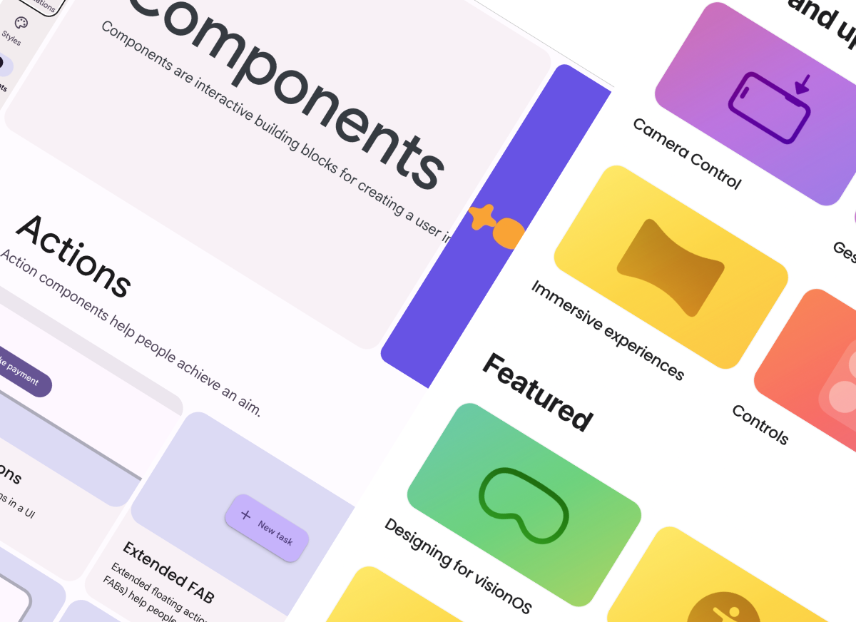
1. Establishing Clear Sections and Hierarchy
The first step was to introduce logical categorization to replace the vague and unstructured sections. Instead of generic labels like "Fundamentals," "Elements," and "Components," I implemented a structured hierarchy inspired by Material Design and Apple’s guidelines. The new organization included the following pages:
- Components: Reusable UI elements such as buttons, cards, and form fields.
- Patterns: More complex design structures like modals, navigation bars, and form layouts.
- Colors: A standardized color palette with clear usage guidelines.
- Icons & Illustrations: A dedicated section with sizing and alignment guidelines.
- Typography: A structured type system specifying font sizes, weights, and styles.
- Grids: Grid systems for layout consistency across designs.
This structured hierarchy made it easier for designers to quickly locate elements, maintain consistency, and follow best practices throughout the design process.

2. Implementing a Consistent Naming Convention
To improve searchability and usability, I introduced clear and structured naming rules:
- Descriptive and Predictable Names: Previously, the design library contained vague names such as Forms 01, Forms 02, Forms 03, or Background, which provided no meaningful context. This lack of clarity made it difficult for designers to understand the purpose of each element and select the appropriate one. To address this, each component was labeled based on its function and variation, improving clarity and ease of use. For example, instead of a vague name like Background, the component was labeled as Components/Focus Indicator, ensuring it was clearly categorized. Similarly, buttons were named Button/Primary and Button/Secondary to distinguish their roles. This structured naming approach allowed designers to quickly locate and apply the correct components, reducing ambiguity and inconsistencies.
- Grouping Related Elements: Components with similar functionality were named using a structured hierarchy to keep them organized in dropdowns. For example, icons were categorized as Icons/Star/Empty and Icons/Star/Filled to ensure easy navigation and logical grouping within the design library. This structure also made it easier for designers to quickly swap between different states in Sketch, improving efficiency and consistency in design updates.
- Avoiding Redundant Elements: The design library contained many elements with the same names. In some cases, they were exact duplicates, leading to unnecessary clutter. In other cases, different designs shared the same name, causing confusion about which version to use. To resolve this, I cleaned up all duplicate elements and ensured that each component had a distinct, meaningful name, making it easier for designers to identify and use the correct version.
These changes made it easier for designers and developers to locate the correct elements without confusion.


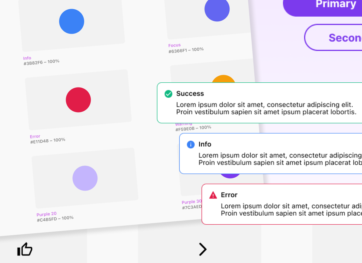
3. Refining the Color System for Consistency
To eliminate duplicate colors and improve accessibility, I streamlined the color library by:
- Deleting Duplicate Color Symbols: In some cases, the library contained up to six duplicate colors, creating unnecessary clutter and inconsistencies. I removed redundant colors to ensure a cleaner, more manageable system.
- Creating a Structured Color Palette: I developed a color palette that provides additional variations of primary and secondary colors. These variations include lighter and darker options that help separate surfaces, maintain visual hierarchy, and ensure accessibility compliance.
- Implementing a Systematic Naming Convention: To make the color system simple and intuitive for everyone, I named colors based on their hue (e.g., Red, Orange, Yellow, Green, Blue). For lightness and darkness, I introduced a numeric scale from 10 to 110 (with the exception of yellow), where:
- 10 represents the lightest shade, and 110 represents the darkest.
- Colors from 10–50 are accessible on black backgrounds.
- Colors from 60–110 are accessible on white backgrounds.
- Reducing Cognitive Load with Three Key Shades: To enhance decision-making speed and simplify color selection, I standardized three essential shades for interactive elements:
- Base Color: The default color used for UI elements.
- Hover State Color: A slightly darker shade to indicate interaction.
- Focus Color: A lighter shade to highlight focus states.
This structured approach ensured that designers and developers could quickly identify and apply colors correctly, improving both efficiency and accessibility while reducing unnecessary complexity.

4. Standardizing Icon and Illustration Guidelines
To address inconsistencies, I:
- Ensured all icons were properly sized and aligned within their frames. Icons and illustrations must fill either the width or the height of the frame (or both) to prevent alignment issues and maintain consistency across designs.
- Created clear guidelines for icon usage, sizing, and alignment.
- Defined illustration usage rules to maintain visual consistency across projects.
These improvements reduced misalignment issues and ensured that illustrations and icons remained cohesive across the product.

The Outcome: A More Usable and Scalable Design system
By applying these changes, I transformed the design library into a structured, scalable, and easy-to-use system that significantly improved workflow efficiency. Designers could now quickly find and reuse elements, while developers had a reliable source of truth, reducing inconsistencies and unnecessary back-and-forth communication.

going Forward
Reflections & Key Takeaways
Lessons Learned from Restructuring the Design Library
Redesigning the design library was more than just an organizational challenge—it was an opportunity to rethink how our team collaborates, maintains consistency, and improves efficiency. Throughout the process, I gained valuable insights into design system best practices, team dynamics, and the impact of structure on workflow.
Here are my key takeaways from this experience:
1. A Well-Structured System Empowers Designers and Developers
By introducing clear organization, naming conventions, and guidelines, I saw a significant improvement in how designers and developers interacted with the system. Instead of spending time searching for components or creating new elements from scratch, they could trust the system and focus on their work.
To ensure consistency across the design-to-development workflow, I also:
- Updated Zeplin to remove outdated designs, making it a reliable source of truth for developers.
- Created a Google Doc that details each component, including when to use it, when not to use it, and any accessibility considerations, so developers can easily reference it when implementing designs.
These improvements reduced confusion, streamlined collaboration, and made it easier for both designers and developers to follow a unified system.
2. Consistency Requires Governance & Documentation
A well-structured system only remains effective if it is properly maintained. Without ongoing governance, even the best-designed library can become disorganized over time. This experience reinforced the importance of:
- Maintaining clear documentation to onboard new team members effectively.
- Defining contribution guidelines for adding, modifying, and deprecating components.
- Encouraging team-wide adoption through training and communication.
By implementing these practices, I ensured that the design system would remain scalable and reliable over time.
3. Iteration is Key—A Design System is Never ‘Finished’
One of the biggest takeaways from this project was that a design system is always evolving. While the restructuring addressed major inefficiencies, I realized that continuous feedback and iteration are essential for long-term success. As the team’s needs change, the system must adapt to stay relevant and useful.

Final Thoughts: Growing as a Designer
This project challenged me to think beyond UI design and consider systems thinking, scalability, and collaboration at a deeper level. It reinforced my ability to analyze problems, conduct research, and implement practical, high-impact solutions that improve efficiency.
Moving forward, I’m excited to apply these learnings to future projects, continuously refining and improving design processes to create seamless, scalable, and user-friendly experiences.
