Grant Messages
This project redesigned the legacy Grant Notes feature used by federal agencies to communicate with grant recipients. The goal was to modernize the experience, reduce errors, and make grant communications easier to track and manage.
Organization
Duration
Tools
My role
Team members
Responsibilities
Project Overview
the product
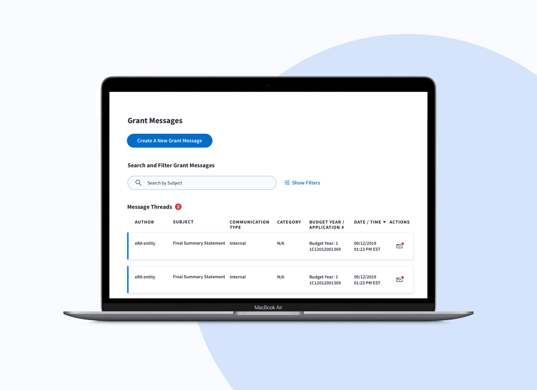
Grant Messages is a communication feature within a federal grants management platform used by government agencies to manage grant programs and communicate with grant recipients. The platform supports 1,500+ federal grant programs across agencies such as HHS, HUD, and SBA, managing over $100B in public funding annually. The project replaced a legacy feature called Grant Notes with a centralized messaging experience that allows users to send, track, and manage grant communications in one place.
the problem
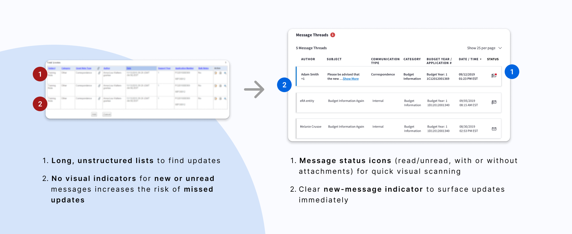
The legacy messaging system made it difficult for users to manage communications efficiently. Users had to manually scan dense tables to find updates, and important messages were easy to miss due to limited visual indicators and unclear system feedback. Because grant communications often involve time-sensitive and compliance-related information, these usability issues increased the risk of missing critical updates and created anxiety around making mistakes.
My Contribution
As the sole UX designer, I led the redesign of the messaging experience from research through final design. I partnered with stakeholders, engineers, and subject matter experts to identify workflow pain points and translate them into interaction improvements that made grant communications easier to track, search, and manage.
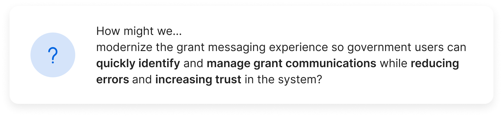
HMW question
Constraints
The redesign needed to operate within several platform and regulatory constraints:
• Section 508 accessibility compliance
• Role-based permissions and secure communication requirements
• A complex workflow used across multiple federal agencies
• Users highly resistant to workflow changes due to risk of administrative errors
our design process
Understanding the user
user research Summary
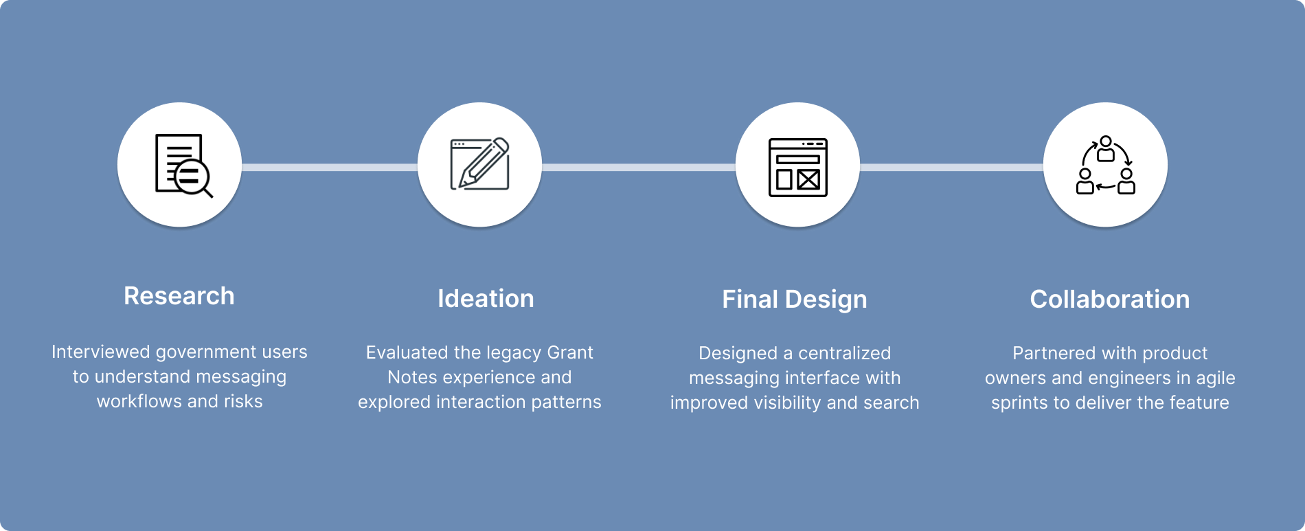
Research
To understand how users manage grant communications, I collaborated with stakeholders and subject matter experts and conducted interviews with government users who regularly work with the grants management platform.
The research focused on understanding:
• how users check for grant communication updates
• how they send and track messages
• challenges with the existing Grant Notes workflow
Key Findings
Finding #1: Users rely heavily on familiar workflows
Many users were accustomed to the existing system and were cautious about major workflow changes.
Finding #2: Missing messages is a major concern
Grant communications can impact compliance and administrative decisions, so users were worried about overlooking important updates.
Finding #3: Users rely on workarounds to reduce risk
Many users manually checked multiple screens or revisited pages repeatedly to ensure they did not miss messages.
Finding #4: Message status was difficult to scan
The dense table layout made it hard to quickly identify new or unread communications.
Defining the Opportunity
Based on the research insights, several key opportunities emerged to improve the grant messaging experience.
1. Create a centralized place to manage grant messages
2. Make message status easier to scan
3. Improve search and filtering
4. Provide clearer system feedback
Starting the design
Design Explorations
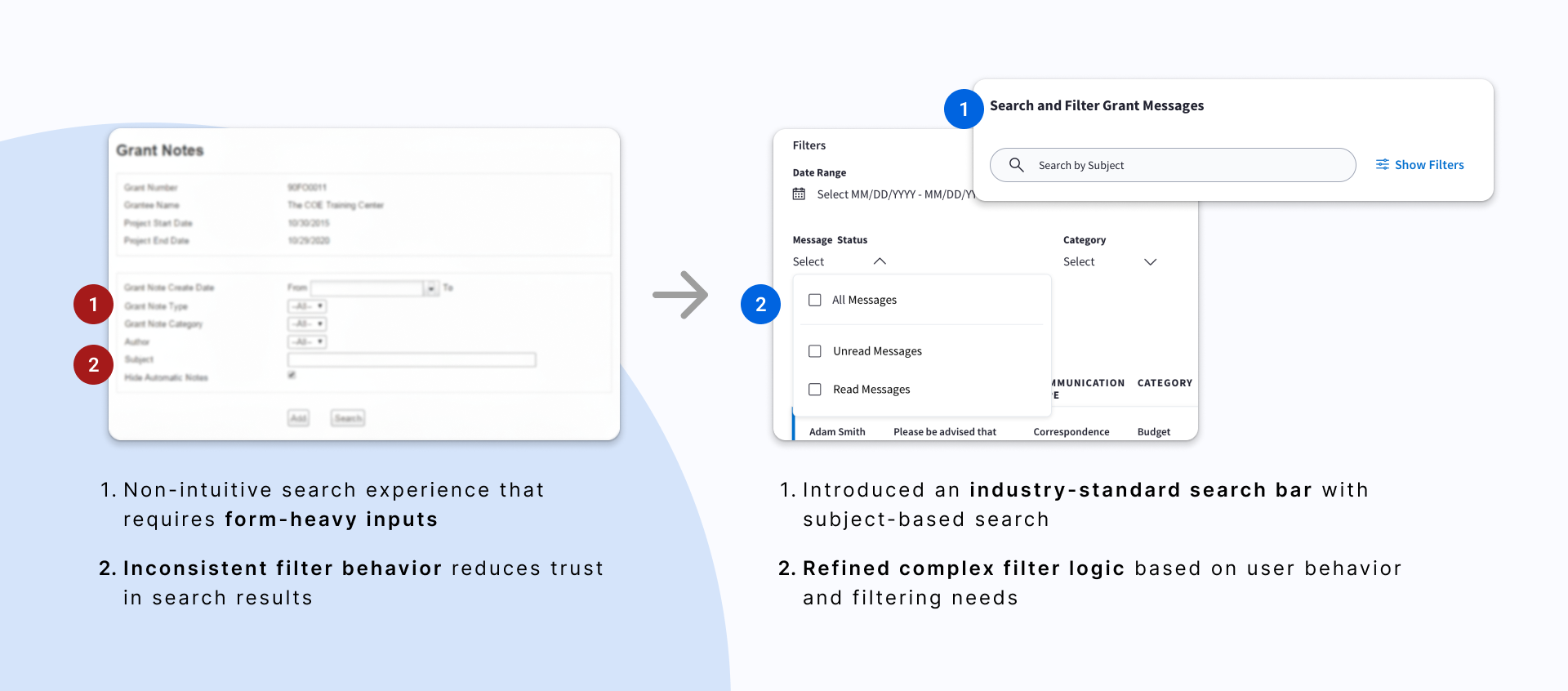
The legacy Grant Notes interface relied on dense tables with limited visual indicators, making it difficult for users to quickly identify new or unread messages. One of the first design challenges was determining how to clearly indicate message status. I explored multiple approaches before selecting a single icon with a subtle unread indicator, which provided better visual scanning while minimizing interface clutter.

Final Design
The redesigned Grant Messages experience focused on three improvements:
#1. Increased at-a-glance Understanding
Design focus: reduce cognitive load & missed updates
Before & After the redesign
#2. Better search and filtering
Design focus: make message tracking fast, clear, and reliable
Before & After the redesign
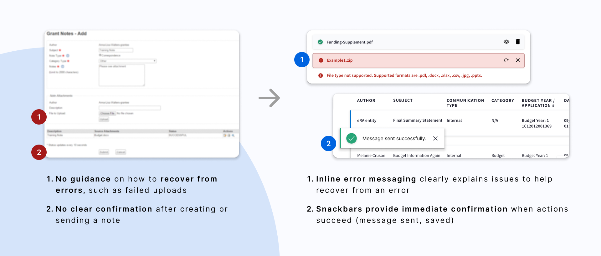
#3. Stronger system feedback
Design focus: increase visibility of system status to build user confidence and trust
Before & After the redesign
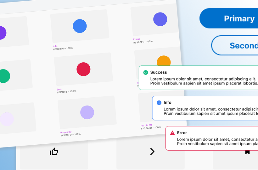
Design system
I was also the design system owner for this team while working on Grant Messages. That allowed me to move quickly by reusing components and extending the system where needed — like adding message status icons and refining search and filter patterns — while keeping everything consistent.
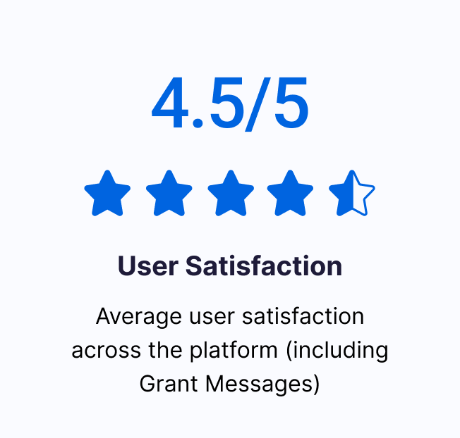
impact
User satisfaction across the platform reached 4.5 / 5
reflection
reflection
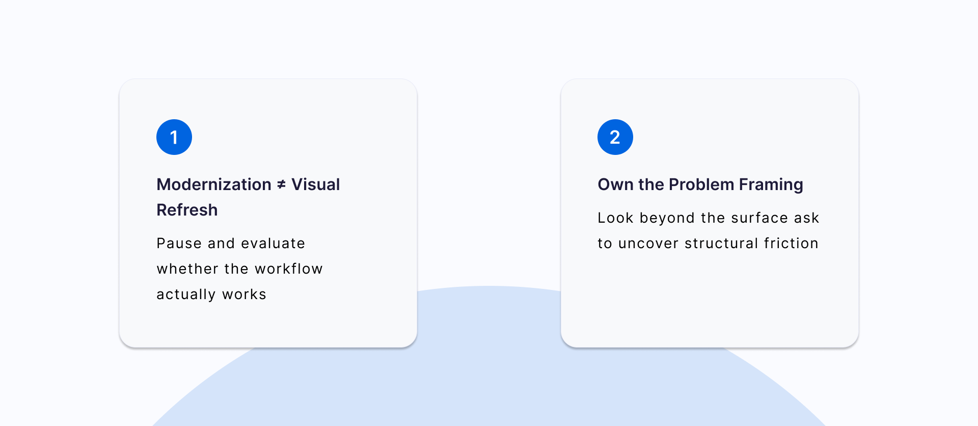
Although the original request was to modernize an outdated interface, research revealed deeper workflow challenges in how users scan, track, and manage grant communications. This project reinforced the importance of looking beyond visual updates to address underlying usability issues.
