Spotter: Supporting Women in Strength Training Spaces
Through surveys, interviews, and field research, we found that many women felt uncomfortable, intimidated, or unsafe while strength training in gym environments. To address these challenges, we designed Spotter, a platform that helps users find trusted workout partners, connect with supportive fitness communities, and navigate gym spaces with greater confidence.

My role
Timeline
Team
My Contributions
• Conducted on-site observations using the fly-on-the-wall method to better understand real-world gym behaviors and environmental challenges.
• Collaborated with the team to generate and evaluate early product concepts based on research insights.
• Facilitated concept testing sessions to validate solution directions and identify opportunities for improvement.
• Created low- and mid-fidelity wireframes and iteratively refined them into high-fidelity prototypes.
• Synthesized feedback from users, peers, and instructors to improve usability and strengthen the overall user experience.
• Delivered a research-informed mobile app concept designed to help women feel more confident, supported, and safe while working out.
Project Overview
the product
Spotter is a mobile platform designed to help women feel more confident, supported, and safe while strength training. Beyond finding workout partners, users can discover fitness communities, navigate gym environments, learn how to use equipment, and report harassment when needed.
the problem
Through secondary research, we found that harassment, intimidation, and discomfort remain significant barriers for many women in gym environments. These experiences can discourage participation in strength training and prevent women from fully engaging in fitness spaces.
a. 56.37% of gym-going women reported experiencing harassment.
b. Women were 2.68× more likely than men to experience sexual harassment at the gym.
c. 92.31% of reported incidents went unreported.
Design question

Design goals
1. Increase confidence in strength training environments.
2. Improve feelings of safety and comfort at the gym.
3. Foster positive social connections and support systems.
4. Make gym spaces and equipment easier to navigate.
5. Create an inclusive experience for users of varying fitness levels.
our design process

Understanding the user
user research Summary
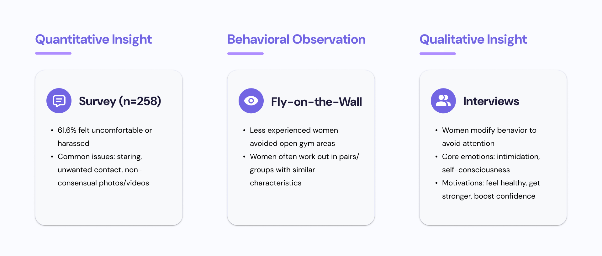
#1. Survey
A total of 258 women responded to our survey. Survey respondents reported various forms of harassment and discomfort.
Q: What forms of discomfort do women experience at gyms?
A: The most common sources of discomfort were being stared at, repeated requests for phone numbers, and having photos/videos taken without permission.

#2. Fly on the Wall
Independent observations were conducted by three people in four different spaces within the Intramural Activities Building at the University of Washington between 9:30 am to 12:30 pm on a Friday. The researchers worked out in each of the spaces and took notes on their phones in between exercise sets to avoid being conspicuous and biasing the participants in any way.
From the observation, the team found that women tended to work out together in groups consisting of 2 or more people and they were similar in racial background, dress style, physical capabilities, and body sizes.
Q: How do behaviors and interactions vary with respect to gender within gym spaces?
A: Women tend to work together with friends.

#3. User Interviews
Our participants were five gym-going women between the ages of 18-35 chosen based on their responses to the screening survey. We also conducted a stakeholder interview with a local gym owner in Seattle. Notes from the interviews were analyzed using affinity mapping, and helped breathe life into our personas.
Q: Why do women change their behaviors at gyms?
A: Women change their behaviors to avoid attracting attention. They change their body language, workout schedule, exercise posture, and clothes.
User Persona
Based on the insights and findings, we created a persona to gain alignment and guide our future design decisions.

Ideation
Based on research insights, we moved on to ideate possible solutions.

We synthesized our research findings and explored three potential solution directions to address the barriers women face in gym environments.
1. Create smart or wearable technology to support personalized gym experiences.
2. Design a guided gym navigation experience to help users confidently explore strength training spaces.
3. Build a community-driven platform that helps women find compatible workout partners and support networks.
Concept Testing
To validate our concepts, we each spoke to friends and a gym owner for an informal concept test. We showed our concepts to each user and asked for their feedback and opinions.
The “find a workout buddy” feature was well-received by all users and stakeholders. Users said they wanted to meet more gym-going women and that having a partner with them would give them more confidence. A gym owner and personal trainer really liked the idea because it would strengthen the gym community.
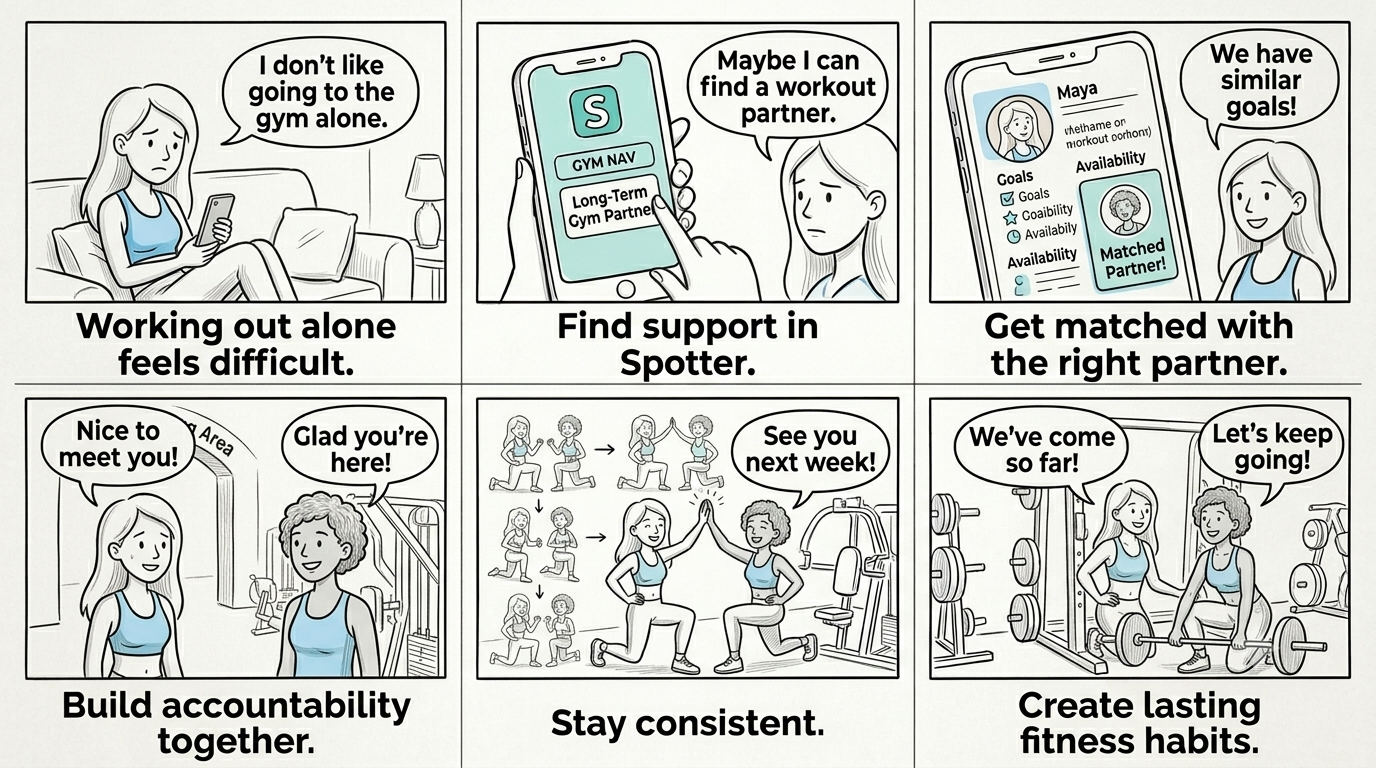
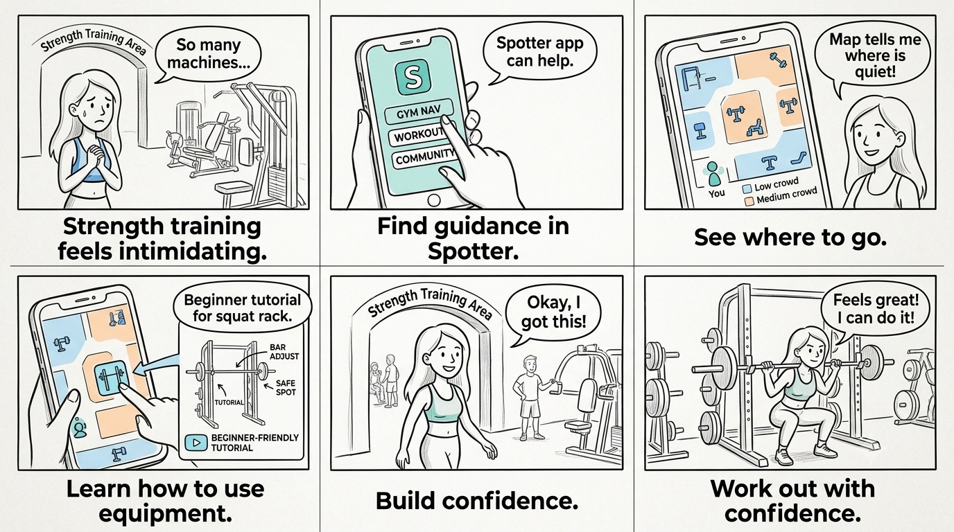
Storyboarding Key User Journeys
We created two storyboards to explore common barriers women face at the gym.These scenarios informed two core Spotter experiences: building accountability through long-term workout partnerships and increasing confidence through gym navigation and equipment guidance.
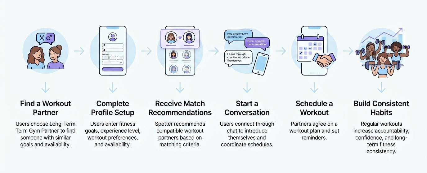
#1. Finding Accountability Through Long-Term Workout Partnerships
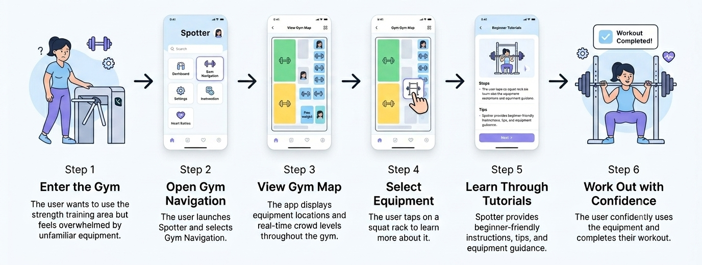
#2. Building Confidence Through Gym Navigation and Equipment Guidance
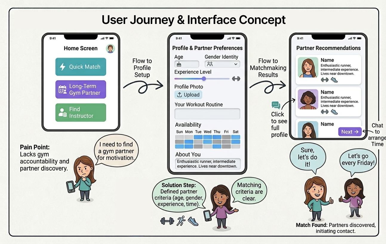
user flow
To better understand the user experience, we mapped the key flows for two core Spotter features: long-term partner matching and gym navigation with equipment guidance
Core User Flow #1. Long-Term Partner Matching
Core User Flow #2. Gym Navigation & Equipment Guidance
Starting the design
digital Wireframes
Guided by our research insights, we created digital wireframes to explore and rapidly iterate on potential solutions.

Mid-fidelity Prototype
We developed a mid-fidelity prototype to evaluate core workflows and gather early usability feedback.

Usability Testing
Usability tests were conducted with three female-identifying students who had access to the IMA building at the University of Washington. We used the severity rating scale described below to help us prioritize and fix usability problems.

Refining the design
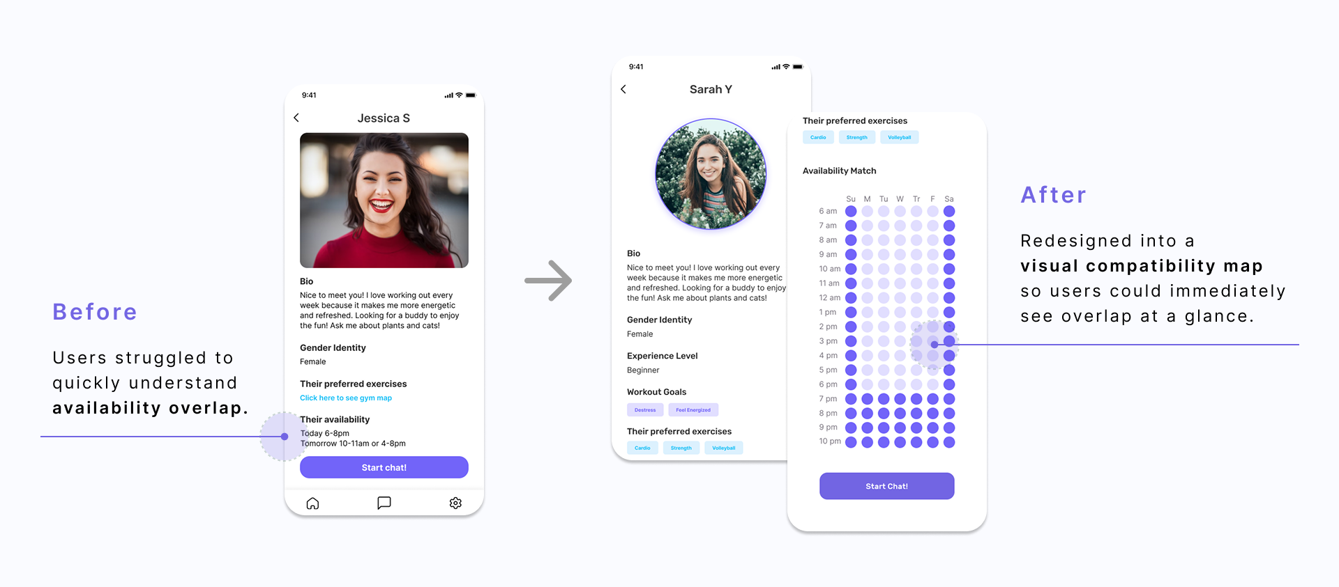
Issue #1. availability hard to see at a glance
2 out of 3 of our users wanted a better way to visualize how their availability matched with their potential partners. The team worked on how to make the information easily scannable.
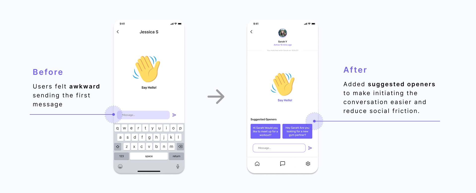
Issue #2. awkward first message
All participants found sending the first text to a potential partner to be awkward. We redesigned to make a streamlined system for sending a request to join.
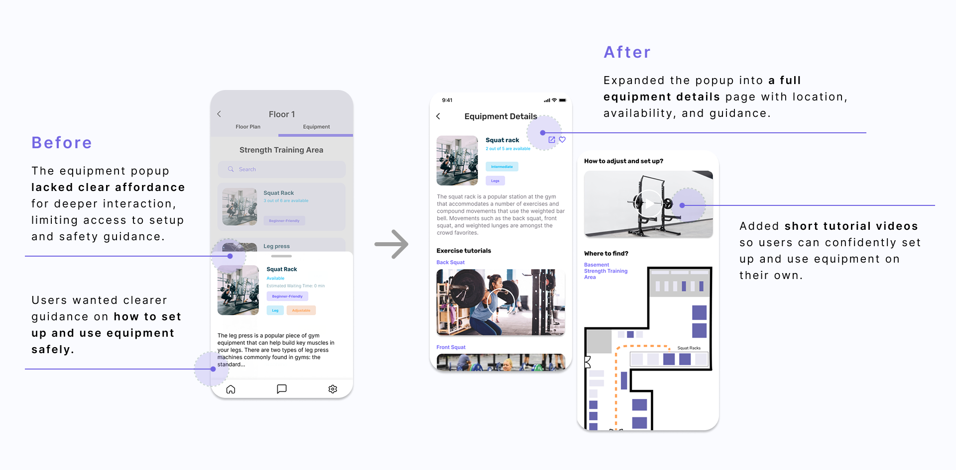
Issue #3. equipment details page were hidden
2 of the 3 participants found the drag interaction to view the entire equipment details page confusing. We changed the draggable pop-up window to a separate page to make contents easily discoverable.
design system
We created a visual style guide to increase the fidelity of our prototype.

High-Fidelity Prototype
Incorporating insights from usability testing, we refined the experience and developed our final design solution.
Click here to interact with the prototype!
Going Forward
what we learned
1. Always ask users
After the ideation phase, we had so many great ideas. They were all our treasured ideas, and we couldn't decide which idea was the best one to pursue within our limited time frames. So the team decided to do a casual concept testing with potential users and asked what they thought about our ideas. Users had an answer to the question we could not solve ourselves. And we were able to redefine our project scope.
2. Be specific about the project scope
Although our team’s broad scope at the beginning helped us generate lots of ideas, it became confusing and overwhelming as we moved into prototyping. If we were to do it differently, we would have defined our project scope and core features earlier in order to use our limited time more efficiently.
next steps
1. Conduct another round of usability studies
If we had more time, we would have conducted one more round of usability studies to see if the changes we made after our first usability testing were effective.
2. Build on the secondary features of the app
We found that during the usability testing, participants seemed to be interested in the features associated with navigating the gym spaces. The time constraint allowed us to mainly focus on the buddy feature.
